CLIENT
Capital One, Canada
ROLE/TEAM
Product Designer (Co-op) working closely with a Product Manager, Lead Designer (Web), Lead Designer (Mobile)
RESPONSIBILITIES
Research | Stakeholder management |
Facilitation| Experience Design | Storytelling
DELIVERABLES
Wireframes | Hi-fi mockups | Clickable prototypes | Presentations
CONTEXT
Capital One Canada is a company specializing in credit cards. The project was to redesign the rewards redemption experience for Capital One-Costco card-holding customers.
SCOPE
This project focused on developing a mobile-first experience for rewards redemption.
TOOLS USED
Sketch | Invision | Google Slides
PROJECT KICKOFF
Paper coupon redemption, unhappy customers
In the existing process, the yearly cashback rewards were sent to all the customers as a paper-coupon via mail. The reward balance was added to the coupon as a cashback in the last week of December and then the reward balance was reset to zero for the coming year. The data gathered earlier showed customer dissatisfaction with rewards redemption.
Through conversations with the product manager, we established the goals, scope, and constraints for this project. Based on the project goals, I collaborated with my design team to define sprint goals and co-design a 3-day sprint. The condensed form of the sprint was used to best manage available time and resources.
Project Goals
1. Align Stakeholders
2. Design mobile and web feature for reward redemption
Scope & Constraints
1. Technological compatibility with Costco
2. Architectural integrity with current app
3. Supports existing rewards process
PROCESS
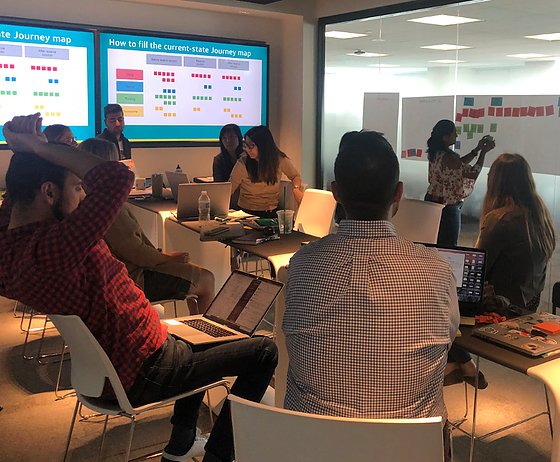
Aligning stakeholders early on
Since the process of reward redemption was touched by multiple teams, it was important to have end-to-end process visibility and align all stakeholders early on. Hence, we decided to use the design sprint approach.
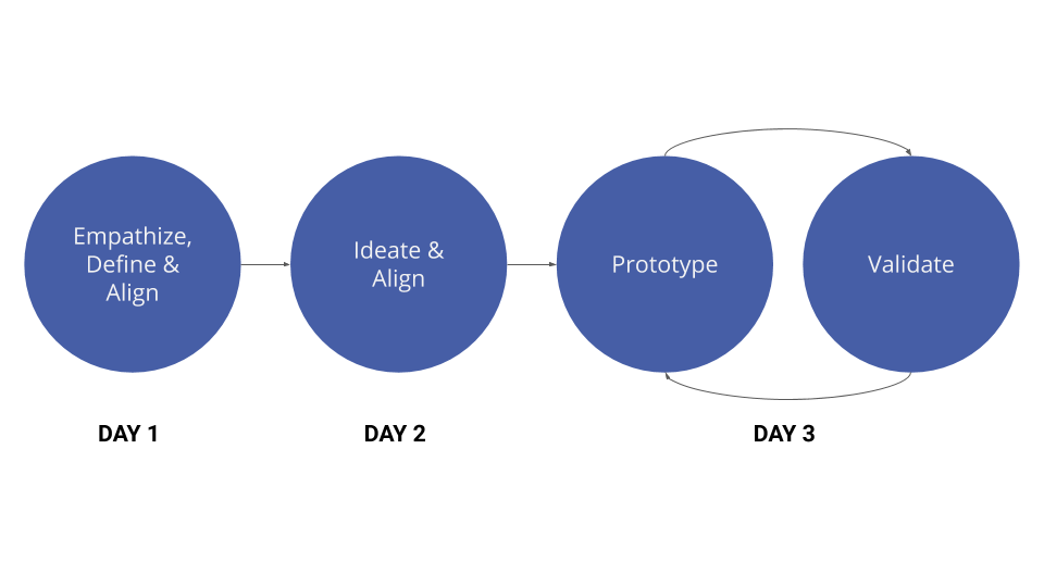
DAY 1: Align on what problem are we solving?
Using Journey mapping, we created an end-to-end journey, identified additional user needs, understand the business motivation.
Using Affinity mapping, we categorized pain points, to find broad focus topics to align stakeholders.
Using the parking lot, we met sprint goals of the day and kept note of important discussions that need to happen.
The effects of unmet user needs on the business were also captured through discussions during the sprint. This allowed alignment and finding a common motivator to solve the problem - saving $$$.
Business challenges
- A surge in customer calls during the cashback rewards season.
- Paper coupons allowed multiple redemptions.
Finalizing the focus of this design sprint
At the end of day 1, we had finalized the user needs that we were going to focus on during ideation.
DAY 2: Align on how are we solving the problem?
To allow effective ideation, I started with providing inspiration for ideation. This was gathered from the secondary research conducted prior to the sprint. Followed by the Crazy 8 activity, to diverge and identify new ideas.
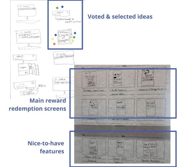
After having a bunch of ideas, I facilitated discussions to understand the technical and business feasibility of the generated ideas and converge a few ideas using Dot voting activity.
Finally using Storyboarding, we integrated the individual ideas into the end-to-end app experience, documented consensus, identified key moments of the experience.
DAY 3 Challenge: Testing our assumption, finalizing a direction.
To keep the cost low, we used paper prototyping, we had a quick prototype to test our hypothesis. We tested with internal users - employees who were Capital One-Costco card users to received quick feedback without the overhead of processes.
What worked well?
- Expected information found on the main screen
- Understood how to use the coupon
- Understood difference: reward balance vs coupon balance
What did not work?
- The entry point not noticed
- Found the copy confusing
- Didn’t want to share redemption moment on social media
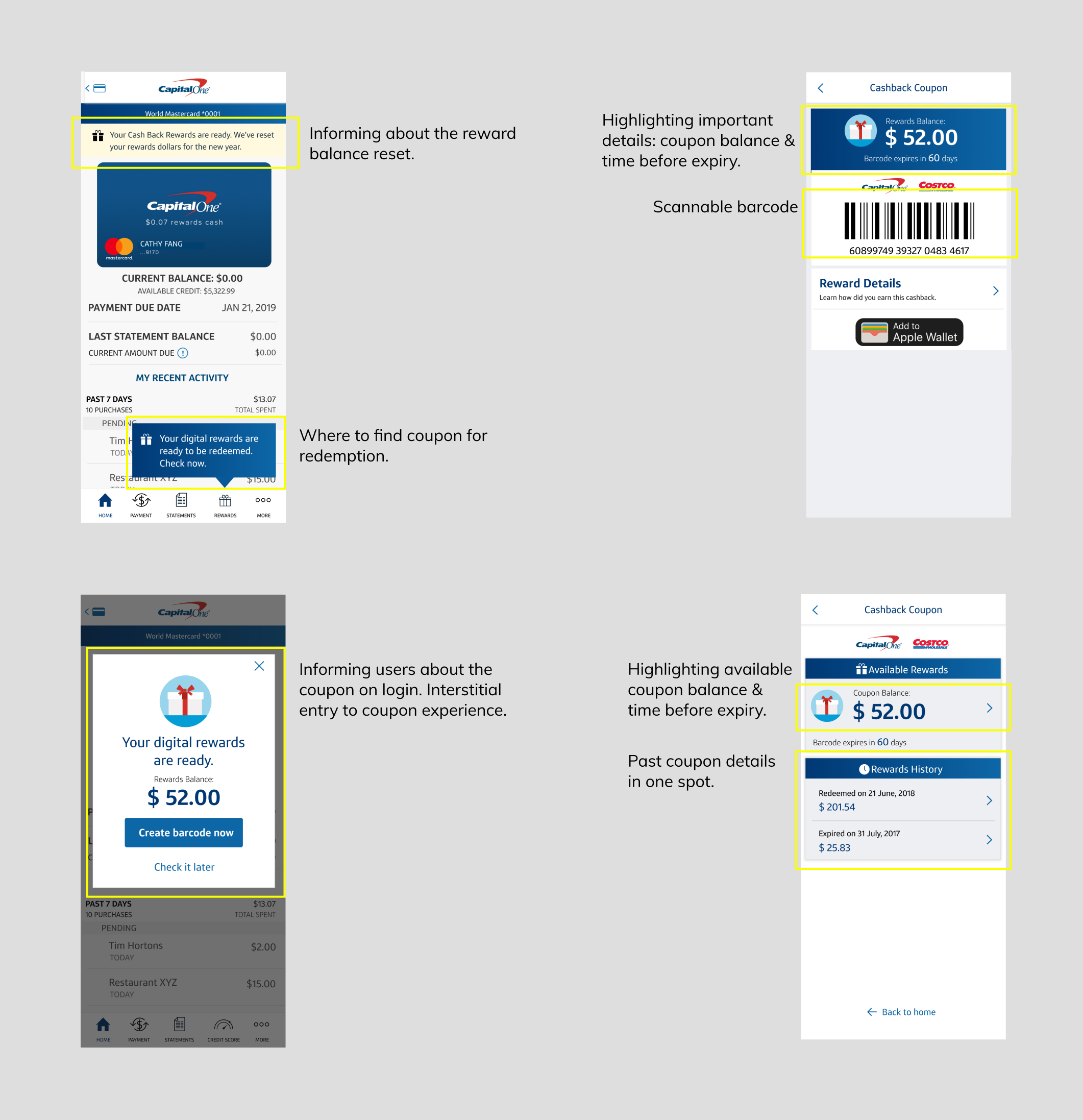
Addressing feedback through wireframes
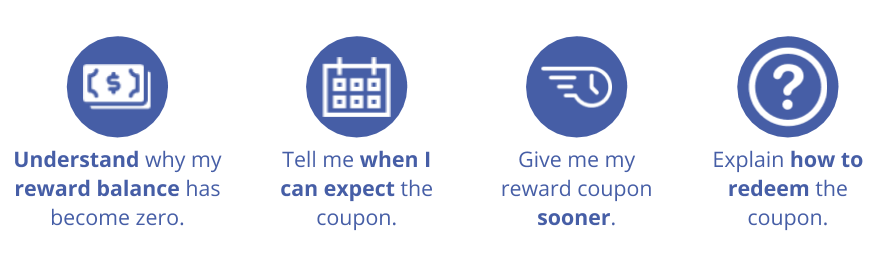
Using the feedback from hallway testing, I designed the main coupon redemption experience focusing on the following use cases:
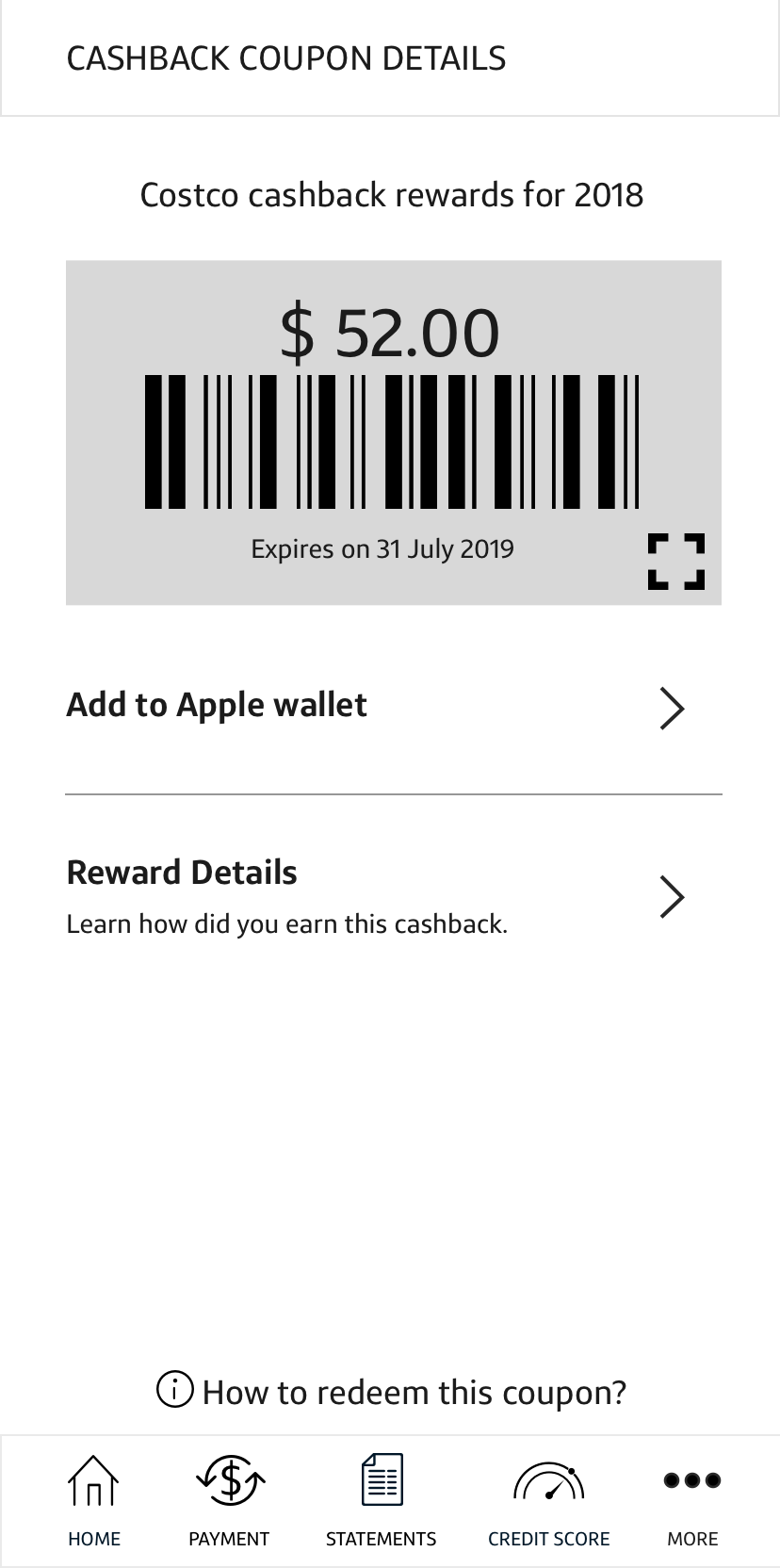
- Ability to access the coupon for redemption
- Highlight when does the coupon expire
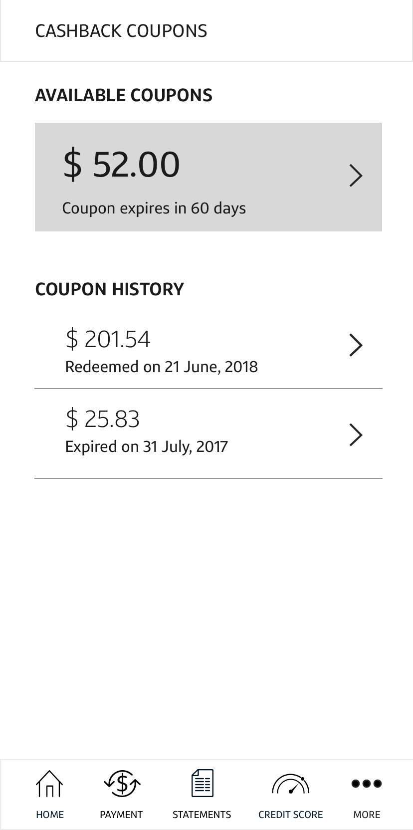
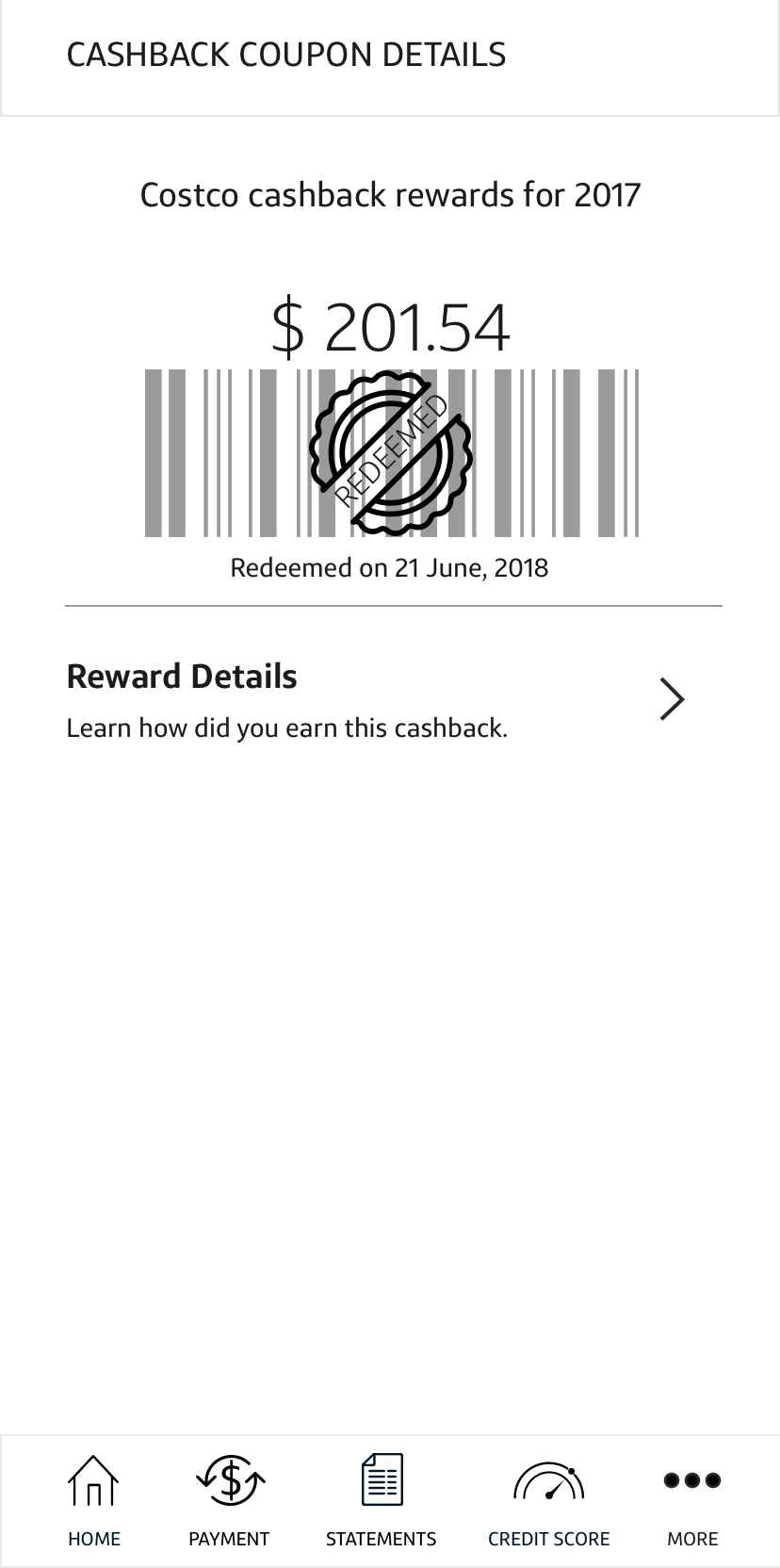
- Ability to view redeemed & expired coupons for the past years
- Ability to view how the coupon balance was calculated
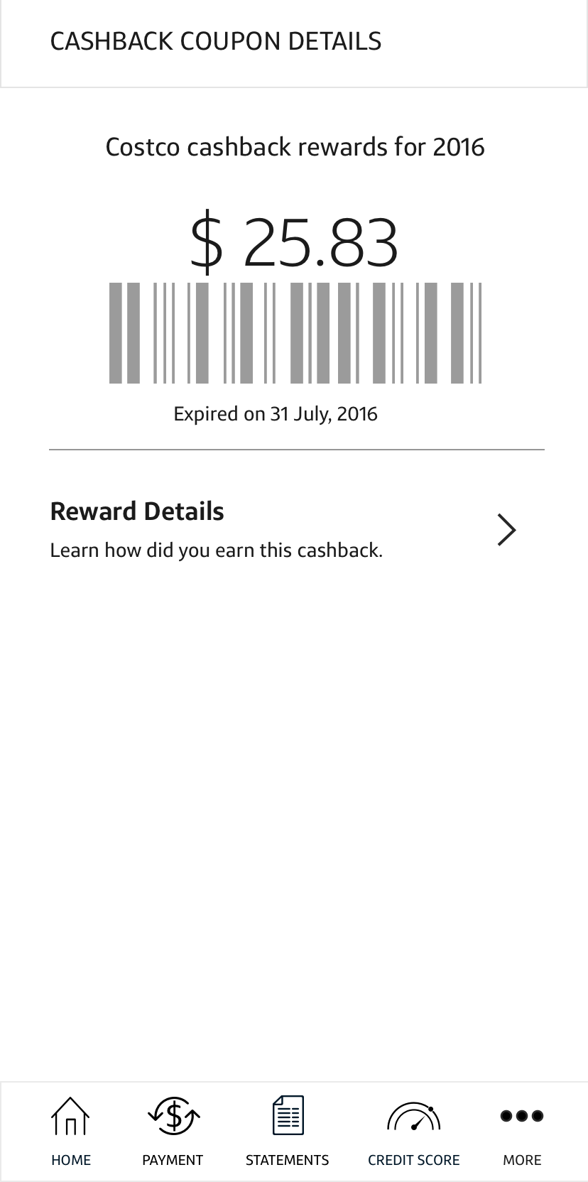
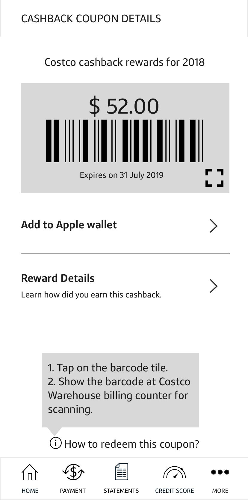
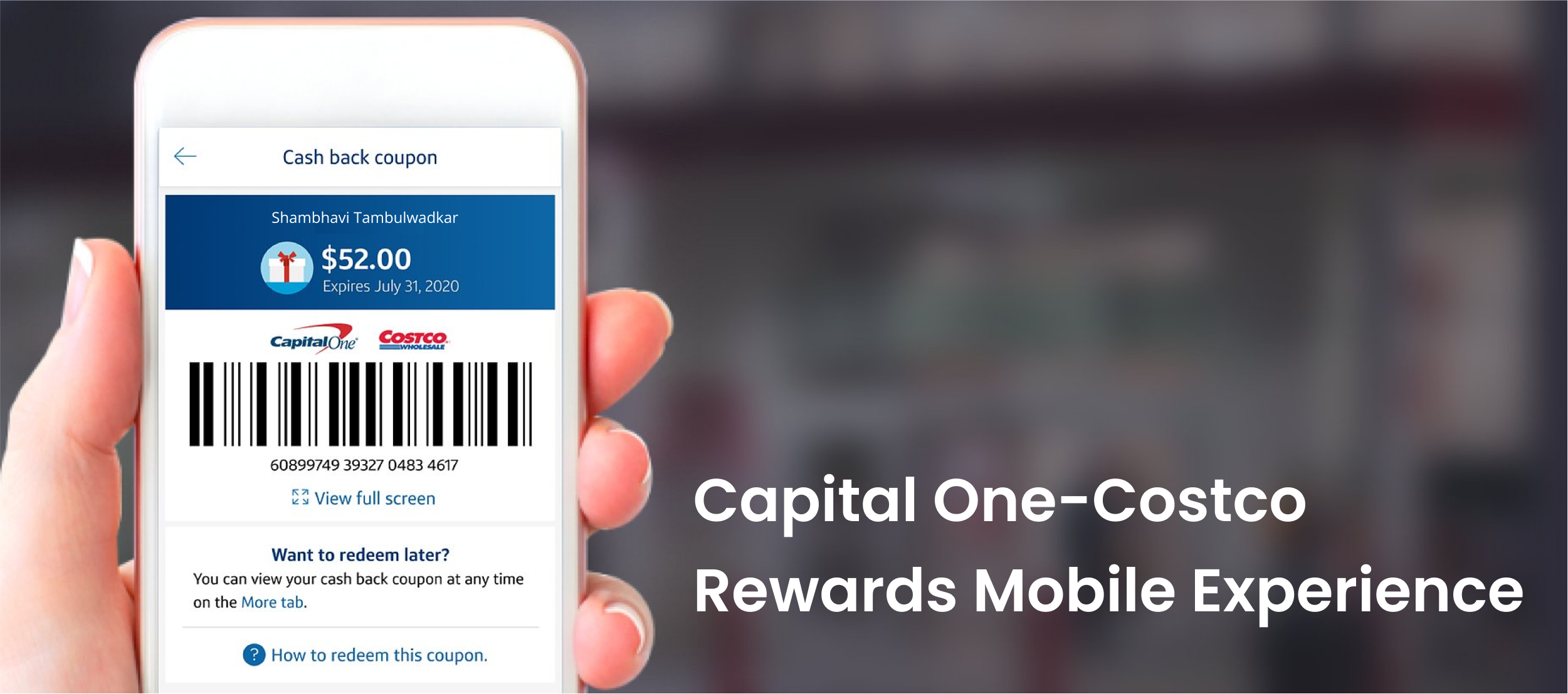
FINAL RESULT
Adding other flows & visual design elements
Post iterations on wireframes with feedback from the design team, I collaborated with the lead designer on visual design and identifying entry points and user flows.
See complete user flow here on Invision
Note: UX writing, MVP planning, and final designs were completed after my tenure at Capital One and are not included in the portfolio.
TAKEAWAYS
Doing it differently
- Plan co-facilitation. Do a dry run.
Co-facilitation can be challenging with new people especially if you’ve different communication styles. A solid plan, well-defined roles, and a dry run can go a long way. - Work on the copy along with design.
Testing with prototypes with half-baked UX writing can confuse the users and take focus away from the interactions, hence it is important to include copywriters in the early stages of prototyping.
The feature launched in February 2020
Other projects

Busrides.ca Usability StudyProject type
Application TrackerProject type

Competitor Analysis - Capital OneResearch, Strategy

Role of Information in Resolution of Creative BlockAcademic Research